Have you ever poured your heart into a colour grade, only to export the video and think, "Wait, why does this look completely different?"
There is quite a bit of mixed messaging online regarding which colour space to use when editing and colour grading on macOS. Some guides swear by Rec.709-A. But here's the catch—using this method often only works if your entire audience is on a Mac. When viewed on a Windows or Android device, the footage can look washed out and just a little off.
Let's look at the numbers on OS Market Share on statcounter.com (at the time of writing), 37.92% of global users are on Android and 26.33% are on Windows. Meanwhile, iOS sits at 18.62% and macOS captures about 6.39%. This means the vast majority of viewers won't be on an Apple-based operating system, so we shouldn't prioritise the best viewing experience solely for Macs.
After moving from a Windows laptop to a MacBook last year, I noticed some frustrating differences between what the display preview inside DaVinci Resolve looked like and my final export and I wanted to get to the bottom of it myself.
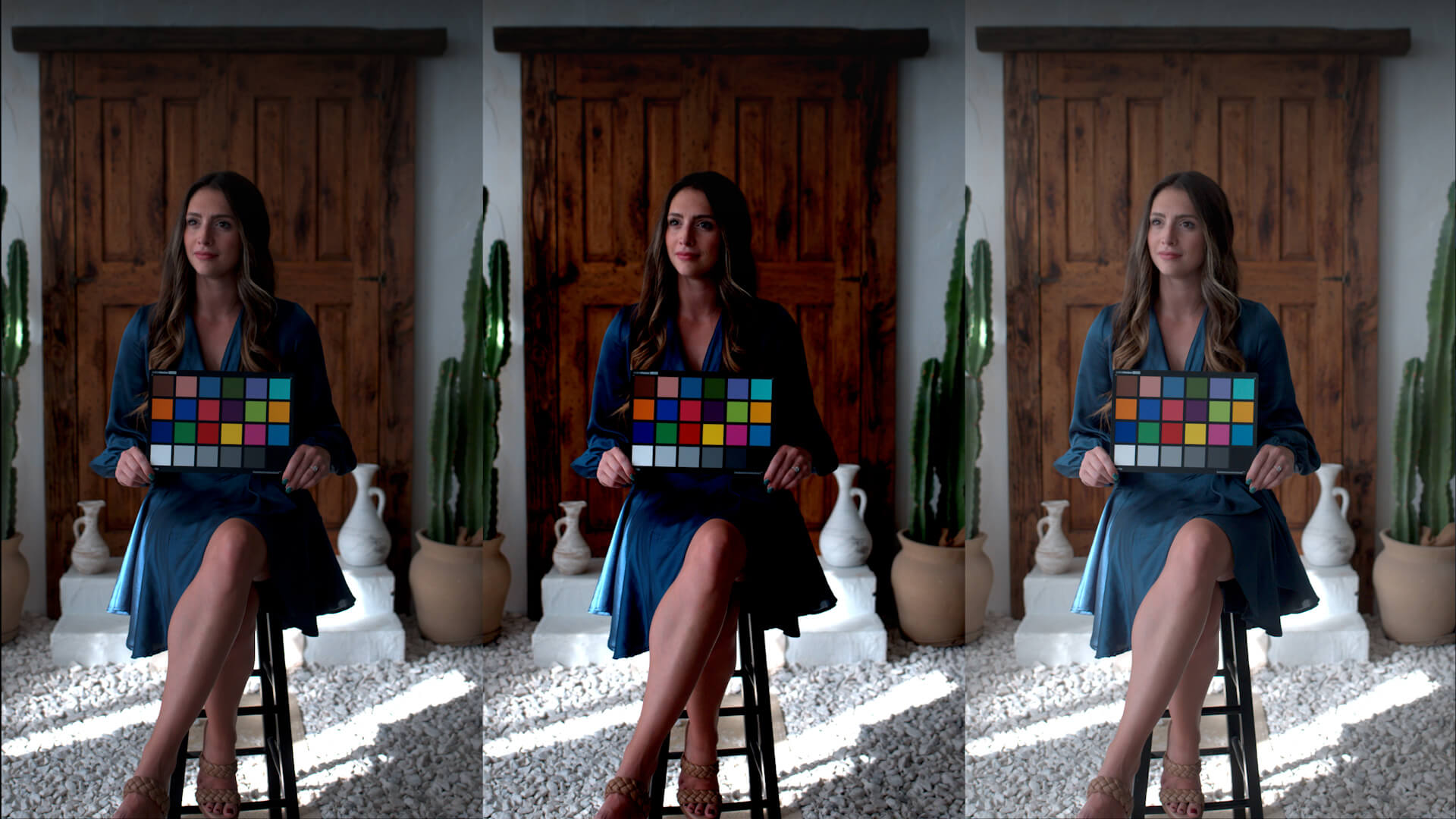
I downloaded a sample clip from Sony's website, and then applied a Color Space Transform using Rec.709 Gamma 2.4, Gamma 2.2, Rec.709-A, and Rec.709 (Scene). I also changed the output colour space within the 'Project Settings' to compare the results side-by-side, and I'm excited to share my findings with you.
Rec.709 Gamma 2.4 vs. 2.2: What's the Difference?
Let's first discuss the difference between Rec.709 Gamma 2.4 and Gamma 2.2. Think of gamma as the curve that controls the contrast and brightness of your midtones and shadows.
- Gamma 2.4 is the traditional broadcast television standard. It's designed for viewing in dimly lit environments, much like a cosy living room at night. It naturally provides a richer, more contrast-heavy image.
- Gamma 2.2, on the other hand, is the standard for PC displays, web viewing, and smartphones. It compensates for brighter, everyday office environments by slightly lifting the image so it doesn't appear too dark on your screen.
Setting Up Your MacBook
What if your editing workflow could be simple and consistent right from the system level? The most impactful setting you'll want to change first is actually your MacBook’s colour display preset.
Head into your system settings and select HDTV Video (BT.709-BT.1886). I found that using the default Apple XDR Display setting will wildly skew the image you see compared to all other devices. It might match beautifully on Macs, but it translates into a flatter, more washed-out image on Windows and Android. Once you’ve changed your setting, I’d highly recommend calibrating your monitor with a hardware tool like one of these. It's a small step that respects your vision and saves you time in the long run.
DaVinci Resolve Preferences
Next, let's open DaVinci Resolve. In your preferences, make sure 'Use Mac display color profiles for viewers' is checked. You could also check the option 'Viewers match QuickTime Player when using Rec.709 Scene', but I don't think it's necessary unless you really want to use Rec.709 (Scene). From my testing, Rec.709 (Scene) is Rec.709 Gamma 2.4.
Project Settings Workflow
To lock this all in, navigate to 'Color Management' in your 'Project Settings'.
- Set your Timeline color space to DaVinci WG/Intermediate (or whichever working space you prefer to craft your look in).
- Set your Output color space to Rec.709 Gamma 2.4 or Rec.709 Gamma 2.2 (depending on personal taste or your target platform).
Once you’ve dialled this in, you can press the three dots at the top of the 'Project Settings' window and select Save Current Settings as Default Preset. Now, your workflow is set up for you every time, empowering you to bypass the technical headaches and get straight back to creating.
I’ve tested this colour management workflow with both H.264 and ProRes exports, uploading them to YouTube and importing them into Premiere Pro. I then compared them side-by-side to the Resolve preview on my Mac, my Windows laptop, and my colour-accurate display. They are practically identical, apart from a few device-specific hardware and settings differences.
This colour management approach allows you to have the confidence that your image is reliable & relatable across almost any screen.
Just to keep things completely transparent, some of the links in this article are affiliate links. If you use them to add a new piece of gear to your kit, I may earn a small commission. The best part? It won’t cost you a single penny extra. In fact, sometimes these links even unlock a cheeky discount just for you. Using them is a brilliantly simple way to support the blog, helping me test more gear and share my findings.
Back to Blog